Graylemon identity
One symbol for a studio that builds. The solid cube every model on our site draws, set as the wordmark's full stop, raised out of the Foundation Matrix in the mark, and animated from matrix to full stop.
- For
- Graylemon
- Source
- Own brand
- Deliverables
- Wordmark, mark, icon, logo motion, colour, type, rules
A studio that builds needed a symbol that is built.
Graylemon diagnoses, builds and launches products. Every framework on our site is drawn as an isometric model: plates for the options, and one block drawn solid, the thing worth building.
That solid block was already the most repeated shape on the site. So we made it the brand: one cube, in true 30 degree isometric, drawn in the models' three blues. The identity doesn't decorate the work. It is a piece of it.
One cube, three jobs.
The cube ends the wordmark, stands alone as the icon, and rises out of the Foundation Matrix in the mark. The wordmark already ends in the cube, so the mark and the cube never sit beside it.

"graylemon" in Newsreader, lowercase, with the cube as its full stop. Four tones: ink, light, and one colour on light or dark.
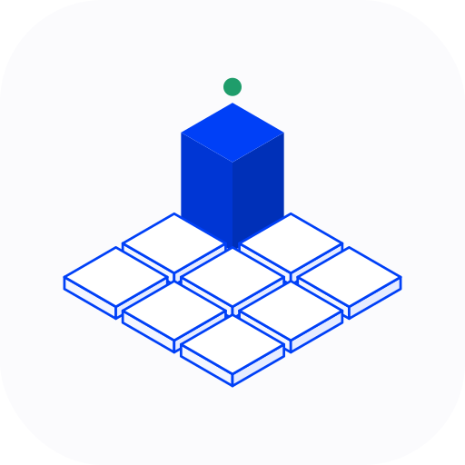
The Foundation Matrix's nine cells, with Strategy and Judgement risen as the solid cube and the green signal above it. For avatars, and anywhere a square is needed.

The cube alone on an ink tile, with the signal. The favicon and the app icon, readable at 16 pixels.
The logo tells its own story in 5.6 seconds.
The Foundation Matrix is laid tile by tile. One cell rises and turns solid, the signal lights, then the cube glides over the name and sets down as the full stop. It comes in paper and ink, at 16:9, 1:1 and 9:16.
On graylemon.io the same motion is the preloader: arriving from outside the site, you watch the cube rise out of its tile and fly to the full stop in the header as the page appears.
Motion follows the same rules as everything else: short and eased, complete at rest, and instant for anyone who asks their device for reduced motion.
Ink, one blue, and plenty of white.
The blue is for action and emphasis, used sparingly. The green is the signal in the mark, and on the site it only ever means something worked.
- Ink
#021720 - Blue
#0040F7 - Cube, left face
#0036D4 - Cube, right face
#0030B8 - Signal
#1F9D6B - Light grey
#F4F5F7
- Headings
- Newsreader, light, never bold
- Text
- Inter
- Labels and figures
- IBM Plex Mono, uppercase and tracked
Rules that run, not a PDF.
An identity holds only as long as its rules do. Ours are written down twice: in the press kit, for people, and as a design system and writing rules our AI tools follow, so a first draft starts on-brand.
- Clear space of at least one cube on every side.
- Never recolour, stretch, outline, re-letter or redraw the wordmark, and never set "graylemon" in type in its place.
- Every figure sits on grid paper, with a caption in mono.
- Middle dots between the parts of a label, and no long dashes anywhere.
The site you're reading is built from that system, page by page.